
2026
Al Diar Petrolink
A powerful visual identity balancing institutional stability with the continuous, dynamic flow of the energy and petroleum sector.
Projects
Branding
Know More
Striking the Perfect Balance Between Grounded Stability and Continuous Dynamic Movement.
The Core Concept
The core visual concept for Al Diar Petrolink relies on achieving an ideal equilibrium. We designed the logo to reflect the "stability and groundedness" inherent in the name "Al Diar," while simultaneously capturing the "dynamics and continuous movement" that define the petroleum and energy industry. The resulting visual identity projects profound confidence, seamless flow, and sustainable growth.

Problem
Modern Arabic Calligraphy Engineered for Fluidity and Institutional Strength.
The centerpiece of the design is the custom, modern Arabic calligraphy used for the word "Al Diar". The smooth, extended curves within the lettering are intentionally crafted to represent "flow". This fluidity directly symbolizes the nature of the company's operations, specifically the extraction and continuous flow of petroleum and energy resources. Concurrently, the letters are built with solid, broad, and stable bases, acting as a visual anchor that reflects the company's robust market presence, reliability, and unwavering strength.
Solution
Symbolizing Ambition and Continuous Upward Growth.
To inject a dynamic touch into the structured typography, we introduced a distinctive elevated, colored stroke above the word. Functioning as a "flare" or a spark of energy, this element takes the place of traditional diacritics. Its forward and upward trajectory is a deliberate design choice, symbolizing the company's continuous development, future-focused ambition, and the constant growth they strive for in delivering their services.

Concept
A Strategic Palette Rooted in Earth's Depth and the Heart of Energy.
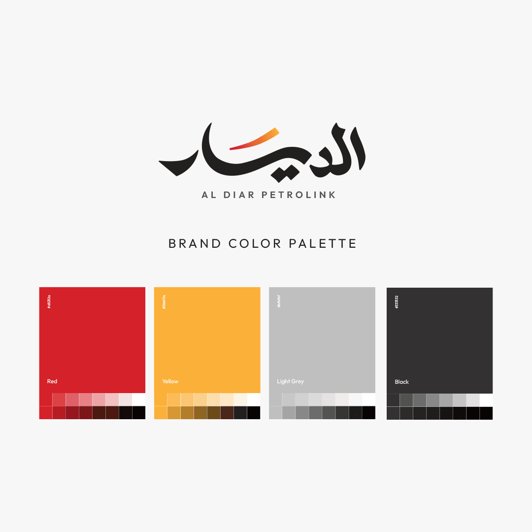
The color palette is deeply tied to the petroleum industry's essence. Black and dark gray represent solidity, institutional power, and professionalism, while also serving as a direct visual link to "black gold" and the profound depths of the earth. In striking contrast, the vibrant color gradient—transitioning from red to orange and yellow—represents the very heart of the energy sector. The red embodies vitality and strength, whereas the shift towards orange and yellow reflects heat, light, and renewed innovation.
More Works


2026
Al Diar Petrolink
A powerful visual identity balancing institutional stability with the continuous, dynamic flow of the energy and petroleum sector.
Projects
Branding
Know More
Striking the Perfect Balance Between Grounded Stability and Continuous Dynamic Movement.
The Core Concept
The core visual concept for Al Diar Petrolink relies on achieving an ideal equilibrium. We designed the logo to reflect the "stability and groundedness" inherent in the name "Al Diar," while simultaneously capturing the "dynamics and continuous movement" that define the petroleum and energy industry. The resulting visual identity projects profound confidence, seamless flow, and sustainable growth.
Problem
Modern Arabic Calligraphy Engineered for Fluidity and Institutional Strength.
The centerpiece of the design is the custom, modern Arabic calligraphy used for the word "Al Diar". The smooth, extended curves within the lettering are intentionally crafted to represent "flow". This fluidity directly symbolizes the nature of the company's operations, specifically the extraction and continuous flow of petroleum and energy resources. Concurrently, the letters are built with solid, broad, and stable bases, acting as a visual anchor that reflects the company's robust market presence, reliability, and unwavering strength.
Solution
Symbolizing Ambition and Continuous Upward Growth.
To inject a dynamic touch into the structured typography, we introduced a distinctive elevated, colored stroke above the word. Functioning as a "flare" or a spark of energy, this element takes the place of traditional diacritics. Its forward and upward trajectory is a deliberate design choice, symbolizing the company's continuous development, future-focused ambition, and the constant growth they strive for in delivering their services.
Concept
A Strategic Palette Rooted in Earth's Depth and the Heart of Energy.
The color palette is deeply tied to the petroleum industry's essence. Black and dark gray represent solidity, institutional power, and professionalism, while also serving as a direct visual link to "black gold" and the profound depths of the earth. In striking contrast, the vibrant color gradient—transitioning from red to orange and yellow—represents the very heart of the energy sector. The red embodies vitality and strength, whereas the shift towards orange and yellow reflects heat, light, and renewed innovation.
More Works
2026
Al Diar Petrolink
A powerful visual identity balancing institutional stability with the continuous, dynamic flow of the energy and petroleum sector.
Projects
Branding
Know More
Striking the Perfect Balance Between Grounded Stability and Continuous Dynamic Movement.
The Core Concept
The core visual concept for Al Diar Petrolink relies on achieving an ideal equilibrium. We designed the logo to reflect the "stability and groundedness" inherent in the name "Al Diar," while simultaneously capturing the "dynamics and continuous movement" that define the petroleum and energy industry. The resulting visual identity projects profound confidence, seamless flow, and sustainable growth.
Problem
Modern Arabic Calligraphy Engineered for Fluidity and Institutional Strength.
The centerpiece of the design is the custom, modern Arabic calligraphy used for the word "Al Diar". The smooth, extended curves within the lettering are intentionally crafted to represent "flow". This fluidity directly symbolizes the nature of the company's operations, specifically the extraction and continuous flow of petroleum and energy resources. Concurrently, the letters are built with solid, broad, and stable bases, acting as a visual anchor that reflects the company's robust market presence, reliability, and unwavering strength.
Solution
Symbolizing Ambition and Continuous Upward Growth.
To inject a dynamic touch into the structured typography, we introduced a distinctive elevated, colored stroke above the word. Functioning as a "flare" or a spark of energy, this element takes the place of traditional diacritics. Its forward and upward trajectory is a deliberate design choice, symbolizing the company's continuous development, future-focused ambition, and the constant growth they strive for in delivering their services.
Concept
A Strategic Palette Rooted in Earth's Depth and the Heart of Energy.
The color palette is deeply tied to the petroleum industry's essence. Black and dark gray represent solidity, institutional power, and professionalism, while also serving as a direct visual link to "black gold" and the profound depths of the earth. In striking contrast, the vibrant color gradient—transitioning from red to orange and yellow—represents the very heart of the energy sector. The red embodies vitality and strength, whereas the shift towards orange and yellow reflects heat, light, and renewed innovation.
More Works