
2026
Adam
A strategic visual identity update for a company operating in vital sectors like shipping and petroleum trading. The new branding reflects continuous flow, energy, and established trust.
Projects
Branding
Know More
A Strategic Evolution to Reflect Global Scale and Vital Operations.
The Core Concept
The goal was not merely an aesthetic facelift, but a strategic re-engineering of the visual identity. We designed the brand evolution to accurately reflect the sheer volume of their operations and geographic expansion. This update highlights their substantial weight in vital sectors like shipping and petroleum trading.

Problem
Balancing Heritage with Modern Logistical Agility.
We repositioned the emblem from the center to the left, creating a "solid structure" reading path where the symbol acts as a protective shield leading the brand name. For the typography, a classic Serif font for 'ADAM' reflects deep roots, reliability, and history dating back to the year 2000. In contrast, a modern Sans-Serif font for 'GENERAL TRADING' communicates operational efficiency, speed, and contemporary logistics.


Solution
Visual Engineering: From Sharpness to Fluidity.
The redesign fundamentally reshaped the emblem's geometry by replacing sharp, aggressive angles with continuous, rounded corners. This specific refinement mirrors flexibility, continuity, and the fluidity of movement. It visually represents the company's capability to manage complex supply chains and ensure a seamless flow of resources, particularly within the petroleum sector, without encountering obstacles.
Concept
Color Psychology Driven by Flow and Vital Energy.
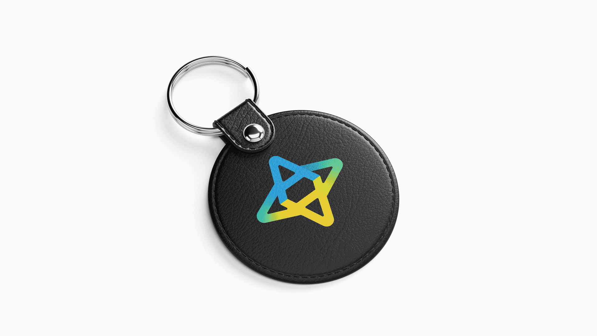
Moving away from traditional flat palettes, we adopted a dynamic color gradient that captures the company's flowing and cross-border nature. The dense blue represents trust, stability, and international maritime and aerial shipping routes. The transition into green and yellow embodies the vitality of trade, energy, and the constant flow of petroleum and vital commodities. This creates a sense of continuous movement and growth, positioning Adam as a highly dynamic entity in the global market.

More Works


2026
Adam
A strategic visual identity update for a company operating in vital sectors like shipping and petroleum trading. The new branding reflects continuous flow, energy, and established trust.
Projects
Branding
Know More
A Strategic Evolution to Reflect Global Scale and Vital Operations.
The Core Concept
The goal was not merely an aesthetic facelift, but a strategic re-engineering of the visual identity. We designed the brand evolution to accurately reflect the sheer volume of their operations and geographic expansion. This update highlights their substantial weight in vital sectors like shipping and petroleum trading.
Problem
Balancing Heritage with Modern Logistical Agility.
We repositioned the emblem from the center to the left, creating a "solid structure" reading path where the symbol acts as a protective shield leading the brand name. For the typography, a classic Serif font for 'ADAM' reflects deep roots, reliability, and history dating back to the year 2000. In contrast, a modern Sans-Serif font for 'GENERAL TRADING' communicates operational efficiency, speed, and contemporary logistics.
Solution
Visual Engineering: From Sharpness to Fluidity.
The redesign fundamentally reshaped the emblem's geometry by replacing sharp, aggressive angles with continuous, rounded corners. This specific refinement mirrors flexibility, continuity, and the fluidity of movement. It visually represents the company's capability to manage complex supply chains and ensure a seamless flow of resources, particularly within the petroleum sector, without encountering obstacles.
Concept
Color Psychology Driven by Flow and Vital Energy.
Moving away from traditional flat palettes, we adopted a dynamic color gradient that captures the company's flowing and cross-border nature. The dense blue represents trust, stability, and international maritime and aerial shipping routes. The transition into green and yellow embodies the vitality of trade, energy, and the constant flow of petroleum and vital commodities. This creates a sense of continuous movement and growth, positioning Adam as a highly dynamic entity in the global market.
More Works
2026
Adam
A strategic visual identity update for a company operating in vital sectors like shipping and petroleum trading. The new branding reflects continuous flow, energy, and established trust.
Projects
Branding
Know More
A Strategic Evolution to Reflect Global Scale and Vital Operations.
The Core Concept
The goal was not merely an aesthetic facelift, but a strategic re-engineering of the visual identity. We designed the brand evolution to accurately reflect the sheer volume of their operations and geographic expansion. This update highlights their substantial weight in vital sectors like shipping and petroleum trading.
Problem
Balancing Heritage with Modern Logistical Agility.
We repositioned the emblem from the center to the left, creating a "solid structure" reading path where the symbol acts as a protective shield leading the brand name. For the typography, a classic Serif font for 'ADAM' reflects deep roots, reliability, and history dating back to the year 2000. In contrast, a modern Sans-Serif font for 'GENERAL TRADING' communicates operational efficiency, speed, and contemporary logistics.
Solution
Visual Engineering: From Sharpness to Fluidity.
The redesign fundamentally reshaped the emblem's geometry by replacing sharp, aggressive angles with continuous, rounded corners. This specific refinement mirrors flexibility, continuity, and the fluidity of movement. It visually represents the company's capability to manage complex supply chains and ensure a seamless flow of resources, particularly within the petroleum sector, without encountering obstacles.
Concept
Color Psychology Driven by Flow and Vital Energy.
Moving away from traditional flat palettes, we adopted a dynamic color gradient that captures the company's flowing and cross-border nature. The dense blue represents trust, stability, and international maritime and aerial shipping routes. The transition into green and yellow embodies the vitality of trade, energy, and the constant flow of petroleum and vital commodities. This creates a sense of continuous movement and growth, positioning Adam as a highly dynamic entity in the global market.
More Works